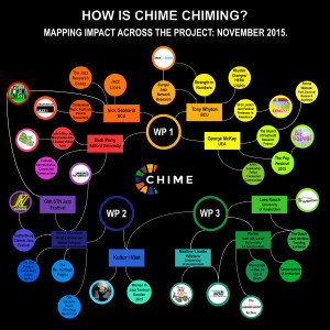
 We want to capture in different forms ways in which the project is having impact — this can be through its collaboration between academics researchers and our parter organisations, including festival, music and sustainability / heritage groups.
For one of these we thought it would be a good idea to have a map of impact — of collaborations, relations — and to revisit this mapping exercise periodically through the project (e.g. on an annual basis) in order to visually capture its scope and spread. Click here to see the higher resolution version of our map of impact at the very start of the project.
This map is made from information gathered from project partners at our inception day event at EFG London Jazz Festival in the Royal Festival Hall in November 2015. We asked all academic partners present to identify up to three key activities, events, other projects, organisations, they were involved with in relation to the project, and to tell the rest of the room a little about each. We noted these down and subsequently produced an infographic-style version of them.
We aim to revisit and (this is our assumption…) add to this map in 2016 and again in 2017, producing a more complex version as work and collaboration takes place. Yes, more dots and curvy lines (we hope)! We anticipate that such an exercise will also illustrate the development of a project.
[Thanks to Rachel Daniel, administrator at University of East Anglia for George McKay and the Connected Communities Programme, including the Impact of Festivals project, for her work on this.]


